

Images
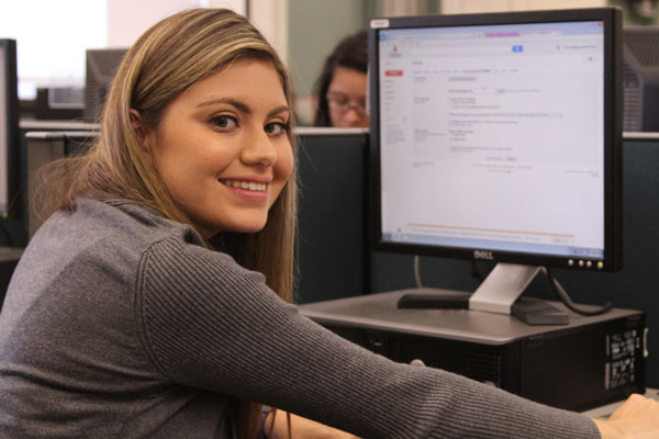
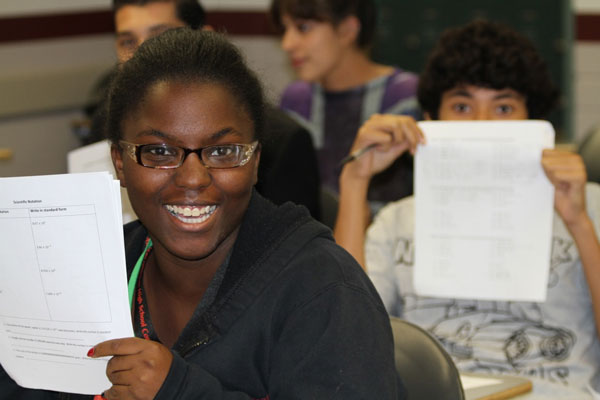
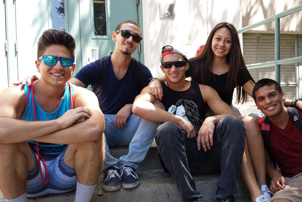
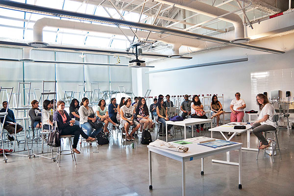
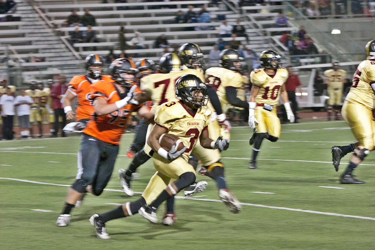
Photos are one of best ways to communicate. They quickly can give a sense of place, convey emotion and energy, and, as cliche as it is, are worth a thousand words.
When choosing photos or taking photos focus on journalistic credibility — realness. We are telling stories with the photos we use.
Things to remember when choosing/ taking photos:
- Avoid blurry images, dark images, awkwardly cropped images
- Try to create visual interest, don't shoot 6 feet up and 6 feet back
- Avoid Flash photography whenever possible, use natural light (bring a tripod and set that exposure)
- Do NOT stage photos (whenever possible) specifically in regards to portraits. Take photos of people in their natural surroundings — realistic.
- Avoid over-editing in photoshop or other photo manipulation programs.
By all means use black and white images. They can add an additional impact and can help differentiate your seciton or program, but if you are going to use black and white, try to be consistent throughout. For instance use it on the section landing page background image and color throughout the interior pages — keep it consistent and tasteful.
Stock Images
Whenever possible avoid using stock images. Yes in some cases they are necessary and if so try to find the most "un-stocky," realistic image you can. There are a number of libraries available to search for stock images, but we suggest using one of the following: veer.com or stocksy.com. The images in these libraries are more authentic and have more of a sense of photo journalism.
Be sure with all images to include content for the title tag and the alt tag.
Read more about the alt tag.
Image thumbnails are cropped to 3:2 ratio for landscape and portrait images.
Stand Alone Image
A basic instance of using a stand alone image. If the image is just a stand alone image with no other context, wrap it in a p tag to create a bottom margin. Be sure to always wrap the image in a column and add img-responsive class to the image. If you would like to float an image left or right, see below under Image Floated.
Be aware that when you add the class img-responsive to the image it will expand 100% of the container width, thus use columns to constrain your width.
<img src="path-to-image/img.jpg" alt="Alt Description" title="Title of Image" />

Image Floated
Images floated left or right with content wrapping. Use the pull-right or pull-left classes to float the images. Be sure to include a width on your image which you can do by using col-sm-# class on the image.
Float Left
For floating an image left all the following classes need to be added to the image: col-sm-#, pull-left, img-responsive, img-thumbnail.
<img src="path-to-image/img.jpg" class="col-sm-# img-responsive pull-left img-thumbnail" alt="Alt Description" title="Title of Image" />
Termsheet hackathon pivot churn rate seed money success supply chain buyer launch party social proof. Deployment influencer series A financing focus growth hacking bandwidth freemium responsive web design funding alpha. Equity branding ecosystem business plan freemium crowdfunding partnership angel investor user experience direct mailing facebook crowdsource infrastructure return on investment. Customer crowdsource metrics advisor ownership handshake long tail first mover advantage business-to-business influencer value proposition.
Float Right
For floating an image left all the following classes need to be added to the image: col-sm-#, pull-right, img-responsive, img-thumbnail.
<img src="path-to-image/img.jpg" class="col-sm-# img-responsive pull-right img-thumbnail" alt="Alt Description" title="Title of Image" />
Termsheet hackathon pivot churn rate seed money success supply chain buyer launch party social proof. Deployment influencer series A financing focus growth hacking bandwidth freemium responsive web design funding alpha. Equity branding ecosystem business plan freemium crowdfunding partnership angel investor user experience direct mailing facebook crowdsource infrastructure return on investment. Customer crowdsource metrics advisor ownership handshake long tail first mover advantage business-to-business influencer value proposition.
Float an Image with a Caption
<div class="caption col-sm-# pull-right img-thumbnail"><img src="path-to-image/img.jpg" class="img-responsive" alt="Alt Description" title="Title of Image" /></div>
Your caption text goes here...
Termsheet hackathon pivot churn rate seed money success supply chain buyer launch party social proof. Deployment influencer series A financing focus growth hacking bandwidth freemium responsive web design funding alpha. Equity branding ecosystem business plan freemium crowdfunding partnership angel investor user experience direct mailing facebook crowdsource infrastructure return on investment. Customer crowdsource metrics advisor ownership handshake long tail first mover advantage business-to-business influencer value proposition. Customer crowdsource metrics advisor ownership handshake long tail first mover advantage business-to-business influencer value proposition.
Image with a Caption below Image
An image with a visible caption.
<div class="caption">

<img src="path-to-image/img.jpg" class="img-responsive" alt="Alt Description" title="Title of Image" />

<p>Your caption here...</p>

</div>

This is a image caption that goes underneath the image.
Image with Caption Overlay
Display text over an image. Be aware of the amount and length of text in comparison to the size of your image. Add the class caption-overlay to your parent div which contains the class caption.

News Thumbs with Caption -- Caption Links
Useful for news and event items.
Essentially instead of wrapping the image and caption information in a div we wrap it in an a tag.


Homepage News Images
These images are slightly different ratio than normal thumbnails. The ratio for the homepage is 6:5. The reasoning is to match up the images with the video.
Below is a quick representation of the homepage.


Thumbnail to Link
Useful for linking a thumbnail to a download, PDF or document.
Thumbnail to Lightbox
Include a thumbnail that can open in a lightbox.
Thumbnail Gallery to Lightbox
Create a gallery of images that open in a lightbox.

Image Slider
Within any page you can include an image slider, with or without caption. This is a useful way to show feature articles, drive messaging or show feature images correlating to a gallery below, amongst many other uses.
We are using RoyalSlider to initiate the slideshow.
Image Slider without Caption
To use this slider in a page, include the necessary RoyalSlider code using the class page-slider.

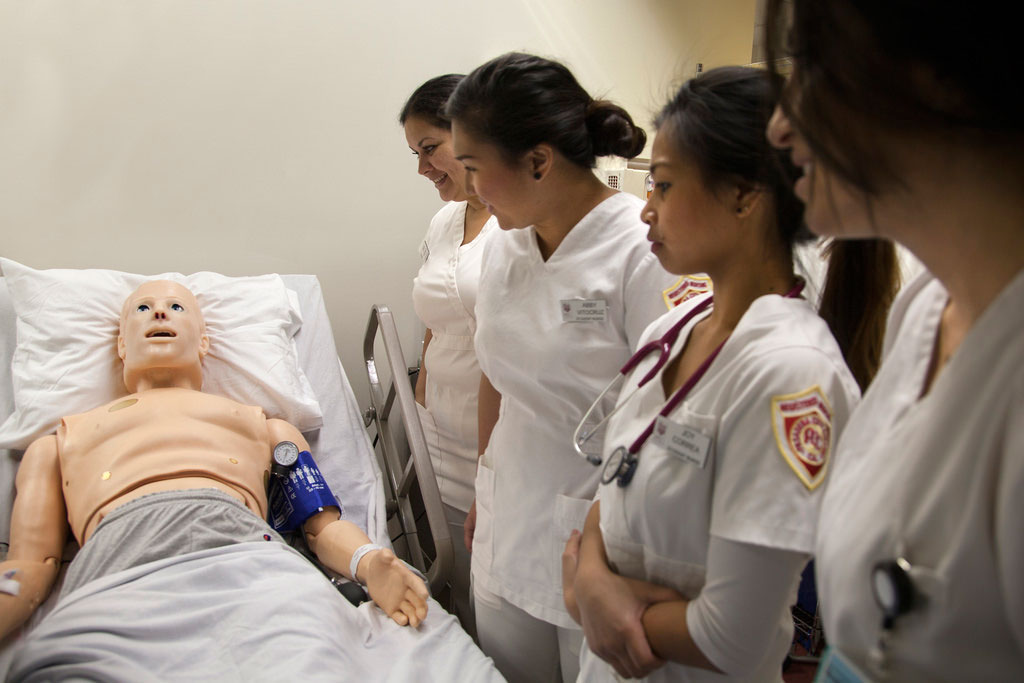
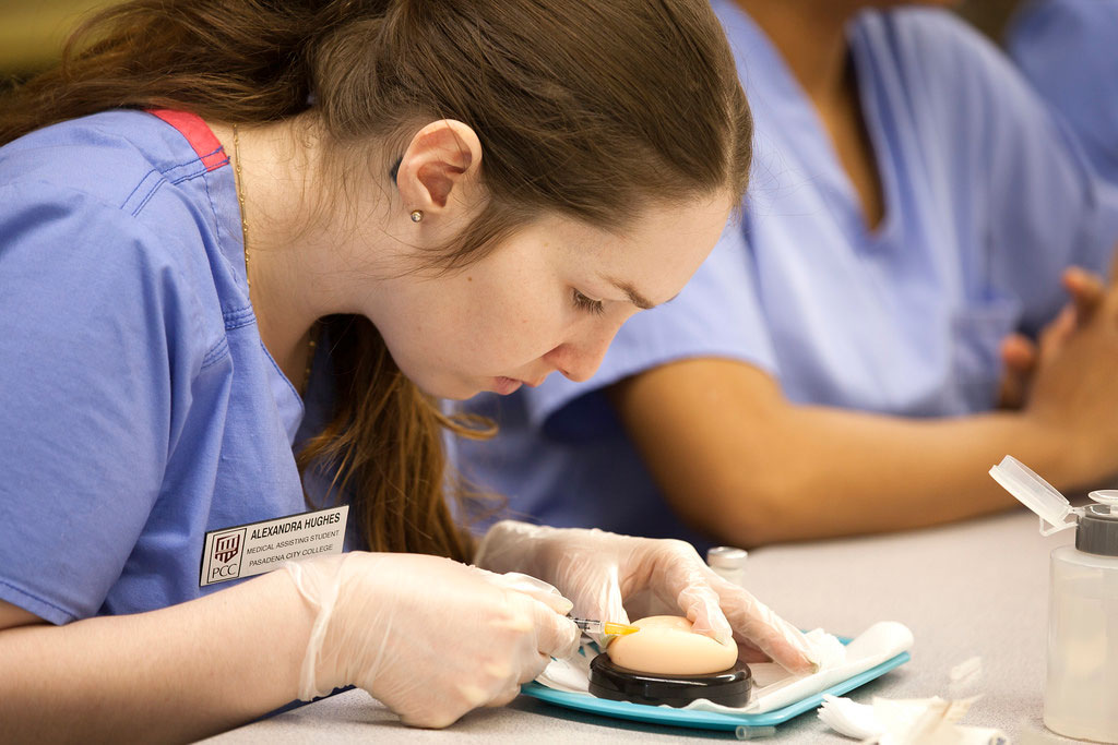

Image Slide with Caption
To use this slider in a page, include the necessary RoyalSlider code using the class page-slider-caption.
Section Landing Page Background Image
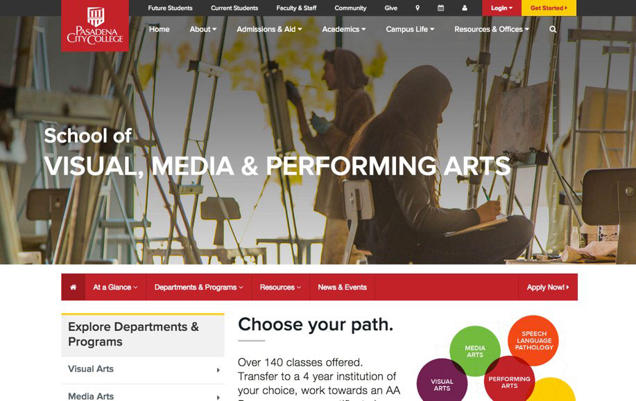
There are two options for the Section Landing Page Background Image — static or fade in/ out slideshow. The Section Landing Page Background Image is a critical part of the landing page and when choosing images you should pay close attention to choosing photos that are:
- impactful,
- tell a story,
- NOT stock,
- give a sense of place,
- give a sense of emotion,
- NOT six foot up and back,
- and make sure your shots are not overly staged.
The images should be real and convey authenticity.
Below is an example image at the correct ratio. Use this ratio/ viewport when taking or selecting photos.

Now that we have an image, how do we get it set up to go on the site?
Once you've chosen your images, we now need to get them setup to be placed on the site. Each image used has two sizes: Large (desktop/ laptop) and Small (tablet/ mobile). The images need to be cropped to an explicit size and need to have an overlay (see below to download PSD template).
Image Sizes
(these both are the same ratio):
- Large: 1340px (w) X 550px (h)
- Small: 767px (w) X 315px (h)
Creating Your Images
- Download the transparent-header-img-overlay.psd (PSD) file.
Download Transparent Overlay Template (PSD) - Open the file in Photoshop.
- Drag your image and replace the layer SAMPLE IMAGE (make sure your image is a layer underneath the layer groups Large Image and Small Image. Resize your image to fill the viewport.
- Make sure the layer group Large Image is visible and Small Image is hidden. Then go to File > Save for Web. When saving for web select jpg and high, then save your file to your local computer.
- Next we're going to create the small image. Head back to Photoshop.
- Hide the layer group Large Image and make sure the layer group Small Image is visible. Go to Image > Image Size and change the width to 767px. Click OK.
- Go back up to File > Save for Web and save the image as a jpg and high and just add "-sm" to the end of the file name.
- Repeat with each image or close Photoshop if you are just using one image.


